Watched HGTV lately? Color trends come and go in the interior design world, so I thought it would be interesting to see if the print world follows suit. Do you know what colors are currently forecasted to be “hot?” How often do you reinvent your print collateral to coincide with such trends? Is your color palette universal enough to stand the test of time?
Believe it or not, color speaks to people with great emotion. What are your paper products saying to your customers?
“Color trends are not conjured up using a crystal ball. They are the result of much observation of our surrounding natural world as well as the influences that will impact our world in the future,” Leatrice Eiseman, executive director of the Pantone Color Institute®
According to Pantone, an X-Rite company, and the global authority on color and provider of professional color standards for design industries, name a few factors that play into the selection of color trends: socioeconomic issues, technology, lifestyles, entertainment, AND MOST IMPORTANTLY, the needs, moods, fantasies and aspirations of CONSUMERS!
Eight featured palettes in PANTONE VIEW home + interiors 2010 offers the newest colors and combinations to best express directional themes for 2010. CMYK printing equivalents are ALSO supplied to accurately reproduce the forecasted colors in marketing materials, in-store signs and packaging.
With our unpredictable economy, is it worthwhile to look at our print materials with an eye to color? What do our color palettes need to convey in such economic unrest?
I believe consumers are looking more to the “old days” for a sense of elegance and a return to quality. Making the old new again appeals to our sense of practicality and resourcefulness – qualities which are definitely back in style. Products and services that also connect emotionally have a better chance of appealing to our cautious consumerism.
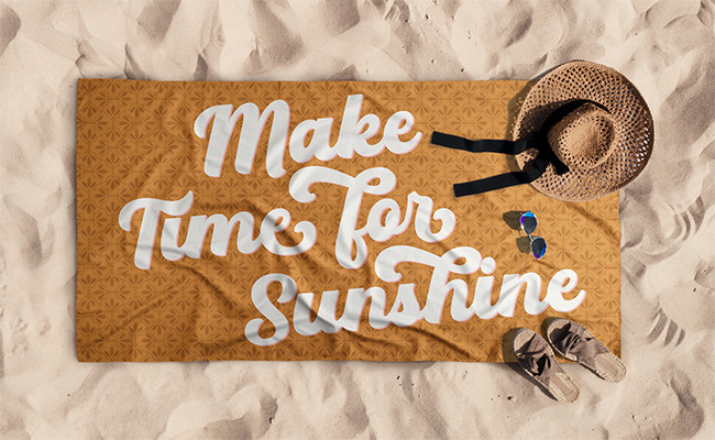
What SINGLE color do you think can take us back and make us feel nostalgic and secure…Pantone has announced that the Color of the Year 2010 is… PANTONE 15-5519 Turquoise, an inviting, luminous hue.
Combining the serene qualities of blue and the invigorating aspects of green, Turquoise inspires thoughts of soothing, tropical waters and a comforting escape from the everyday troubles of the world, while at the same time restoring our sense of wellbeing.”
Your browser may not support display of this image. Your browser may not support display of this image.
According to Pantone, whether envisioned as a tranquil ocean surrounding a tropical island or a protective stone warding off evil spirits, Turquoise is a color that most people respond to positively. It is universally flattering, has appeal for men and women, and translates easily to fashion and interiors. With both warm and cool undertones, Turquoise pairs nicely with any other color in the spectrum. Turquoise adds a splash of excitement to neutrals and browns, complements reds and pinks, creates a classic maritime look with deep blues, livens up all other greens, and is especially trend-setting with yellow-greens.
Looks like we can’t go wrong with turquoise – add a splash where it works within your current style guidelines. Perhaps your design already has a placeholder for each year’s current color trend. If not, give it some thought!