 You’ve been at your computer for days on end coming up with the perfect design for your company’s print collateral. The boss approved the layout, the copy has been proofed and now you’re ready to send your masterpiece design to the printer – or are you?
Correct file preparation for commercial printing is almost as important as the aesthetics of the design. This is the beginning of the payoff stage of the project. We know how hard you worked on the design and we want you to receive all the accolades you deserve by delivering you an amazing print project. That said, this is the first of Prisma Graphic’s File Preparation Best Practice Series to consider before submitting your files to a commercial printer.
File Preparation Best Practices: Color
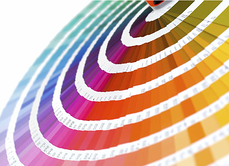
Color: Is your design full color, spot colors or single color? If you designed your collateral to be printed in full color the file needs to be saved as CMYK (Cyan, Magenta, Yellow, Black) and we recommend using the Pantone© Bridge builds for accuracy. This will ensure that our four color process printing is on the money. Many times files are submitted as RGB (Red, Green, Blue) which is standard for web design, since monitors are calibrated in RGB. (To learn more of the differences between CMYK & RGB – please see our previous blog post.)
If your project is designed in spot color please make sure the correct PMS (Pantone Matching System) color is designated through all of the files. If you use single colors in the design make sure the designated colors are specified as PMS numbers and not a CMYK build. Accidentally using a CMYK build will add to the complexity of the project and normally costs are incurred.
Black: Black is black right? Wishful thinking. There is black and the there’s rich black. Rich black, in printing, is an ink mixture of solid black over one or more of the other CMYK colors, resulting in a darker tone than black ink alone generates in a printing process. Prisma’s rich black is 40c, 30m, 0y and 100k. (See wikipedia article for full definition) Normal text (or copy) need only be set as 100% black to ensure correct printing without over saturation. Selecting the proper use of black will make your print project go smoother in the prepress production phase.
A great rule of thumb, before submitting files that use metallic colors or special varnishes, is to call Prisma Graphic to make sure the file is set up properly. We’ve found that a simple phone call will typically save our clients time and money.
Next month we’ll discuss fonts and images. What’s the right resolution of images for commercial printing? Do I need to include all images and fonts?
Do you have any general rules you follow for color when prepping your files for a commercial printer? How do you handle your color management? The floor is open, We want to hear from you!
_______
[Prisma Graphic is a full-service, marketing solutions provider with an emphasis in commercial printing that specializes in online marketing supply chain management. Utilizing cutting-edge technology and a commitment to customer service, we partner with clients to develop cost-effective programs that execute integrated brand campaigns and highly-targeted business communications. Our ongoing evolution is to deliver sales opportunities at the lowest possible cost.]