The Challenge
Uchi is one of Austin’s most respected restaurant groups, known for a dining experience built on precision and craft. When Uchi needed a direct mail piece to reach guests, an ordinary envelope wouldn’t do. It had to feel like an invitation, not a flyer, and it had to reflect the same care that goes into every plate.
The Impact
For a restaurant, the guest experience starts long before anyone sits down. What arrives in the mail sets an expectation. A thin card or a flimsy envelope suggests a rushed, forgettable meal. A piece with real weight, texture, and finish suggests the opposite: that the same attention paid to sourcing a technique in the kitchen carries through to every touchpoint with a guest.
Our Approach
We worked with Uchi to design a mail package where every material and process choice served the same goal: make the piece feel handled, not manufactured.
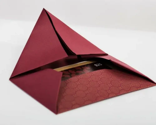
The envelope opens like origami rather than a standard flap, so the first interaction is already different from anything else in the mailbox. We printed it offset on a Komori LS-40 Perfector and Coater, a press built for exactly this kind of precise, high-quality run, onto a heavyweight 70# French Paper in Construction’s Paver Red. The color and the paper’s natural texture do a lot of the work before a guest reads a single word.
Inside, a promo card and a matching holder carry the same restraint. Both were printed digitally on an HP Indigo 5500, which let us hold consistent color and crisp detail even in a smaller-format run. The card sits on a smooth 110# Flo Digital Dull Cover, and the holder on a 100# Environment Digital Cover, a recycled stock that adds a subtle, tactile finish without pulling focus from the design.
Even the outside of the envelope was considered. Rather than a printed label that looks mass-produced, the kraft address labels were digitally printed on Kodak Digimaster HD 50 press onto 60# brown kraft, giving the whole piece a handwritten, personal quality from the moment it lands in a guest’s hand.
The Outcome
The finished piece gives Uchi a mail experience that matches the standard guests already expect from the restaurant itself. Every material, from the Paver Red envelope to the kraft labels, was chosen and produced to hold up under close attention, the same way a menu or dining room does. The result is a physical extension of the brand, not an afterthought mailed alongside it.
What’s Possible
A restaurant’s brand lives in more than the dining room. It lives in every piece a guest touches before they ever sit down. When paper, press, and finish are chosen with that in mind, even a mailer becomes part of the experience.
Interested in a print piece built around what your brand needs to say before a guest arrives? Contact us to talk through paper, process, and finish for your next project.