Overview
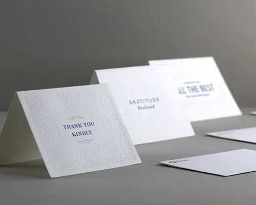
Frost Bank partnered with Prisma to produce a set of premium cards that demanded an exceptional level of print craftsmanship. The finished piece needed to reflect the caliber of the Frost Bank brand — clean, tactile, and unmistakably high-end.
The Challenge
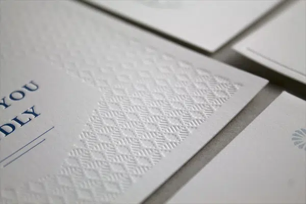
Achieving the intended design called for far more than standard production. The specialty stock, precise color matching, and layered deboss work meant there was little room for error — every variable in the press run had to be controlled to protect the integrity of the final piece.
The Solution
Prisma’s team approached the project with precision at every step:
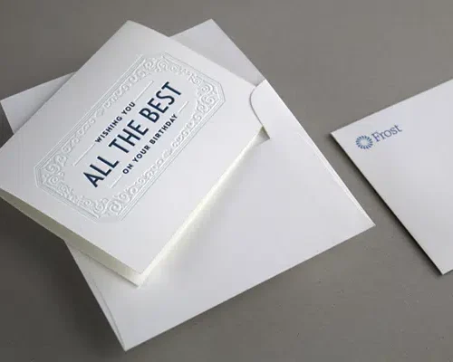
- Specialty Stock: Printed on 100# Crane Lettra Cover in Pearl White, a premium cotton stock chosen for its texture and refined finish.
- Reduced Press Speed: Slowing the press allowed for tighter control over ink lay and registration across each sheet.
- Exact Color Accuracy: Printed in PMS to ensure precise, consistent color matching true to the Frost Bank Brand.
- Precise Deboss Alignment: Combined registered and blind deboss techniques, requiring exacting alignment to achieve crisp, dimensional detail without disrupting the printed design.
- Matching Envelopes: Produced coordinating envelopes to complete a cohesive, polished final package.
The Results
The result was a beautifully executed card that balanced subtlety and craftsmanship — a piece where texture, color, and dimension worked together seamlessly. The careful, methodical production process ensured the finished product met the high standards Frost Bank’s Brand demans.